
Infuse Your Walls with Personality Using Handmade Abstract Painting

Introduction
Every home tells a story; abstract art helps you write it in color, texture, and motion. A handmade abstract painting doesn’t merely occupy a wall, it shapes mood, sparks conversation, and gives your rooms a living heartbeat. For homeowners curating handmade paintings for home, abstracts are especially powerful because they carry feeling without prescribing a single narrative. That freedom lets the same canvas feel contemplative in a bedroom, energizing in a studio, and welcoming in an entryway.
In this guide, you’ll learn how to read abstract visuals, choose pieces with intention, place them for maximum impact, and care for them so they remain vivid companions for years. We’ll also share concise sizing and placement cues and a clear, neutral conclusion, followed by a brief brand note, so you can move from inspiration to confident action.
Why Abstract, Why Now
The pull toward abstraction has accelerated as interiors trend personal and layered. Without literal subject matter, an abstract can harmonize with diverse furniture eras, palettes, and materials, oak and boucle, stone and steel, while still asserting its own presence. That flexibility makes it a reliable anchor as your home evolves: pillows change, rugs rotate, yet the painting remains the constant that keeps the space feeling intentional.
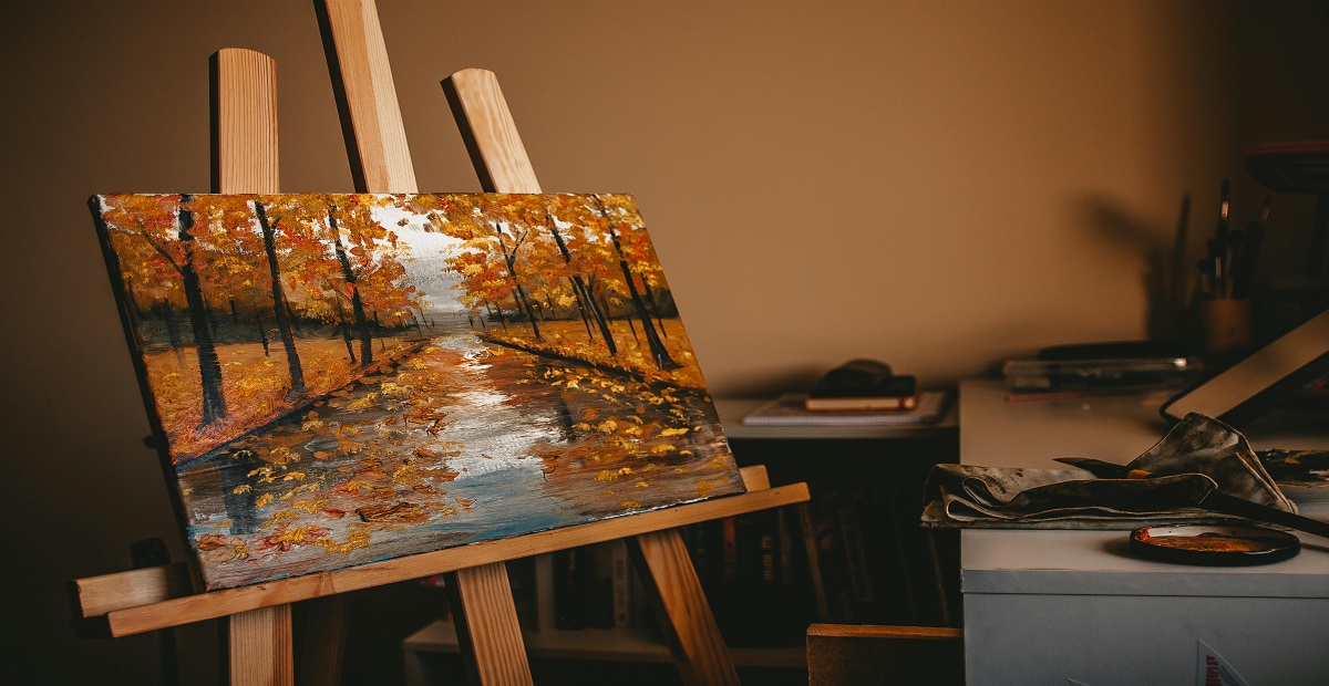
Abstracts also excel at emotional tuning. Large, slow brush fields calm; crisp, interlocking shapes sharpen focus; meandering line work invites curiosity. Because a handmade abstract painting records real movement, pressure variations, lifted edges, feathered transitions, it rewards slow looking. Stand close and you’ll see decisions in the paint; step back and you’ll feel the composition breathe. This dual experience is why abstracts are consistently chosen for high-traffic living areas and reflective corners alike.
Reading the Language of Form
You don’t need an art degree to “get” abstract work. Train your eye to notice three cues: gesture, edges, and contrast. Gesture matters, because long, confident strokes communicate momentum and clarity, while softer, layered gestures feel contemplative and musical. Edges signal structure and atmosphere; hard edges create structure, whereas soft or broken edges suggest depth. Contrast sets the mood; big value jumps (light vs. dark) add drama, while close values feel serene and expansive.
When you’re shortlisting handmade paintings for home, jot a quick note beside each candidate—“steady,” “uplifting,” “grounded,” “playful”—and use those one-word impressions to match the canvas to the job of the room, whether rest, gathering, focus, or welcome.
Rooms That Shine with Abstracts
Abstracts can be the difference between a room that looks finished and one that feels finished. Consider these practical placements:
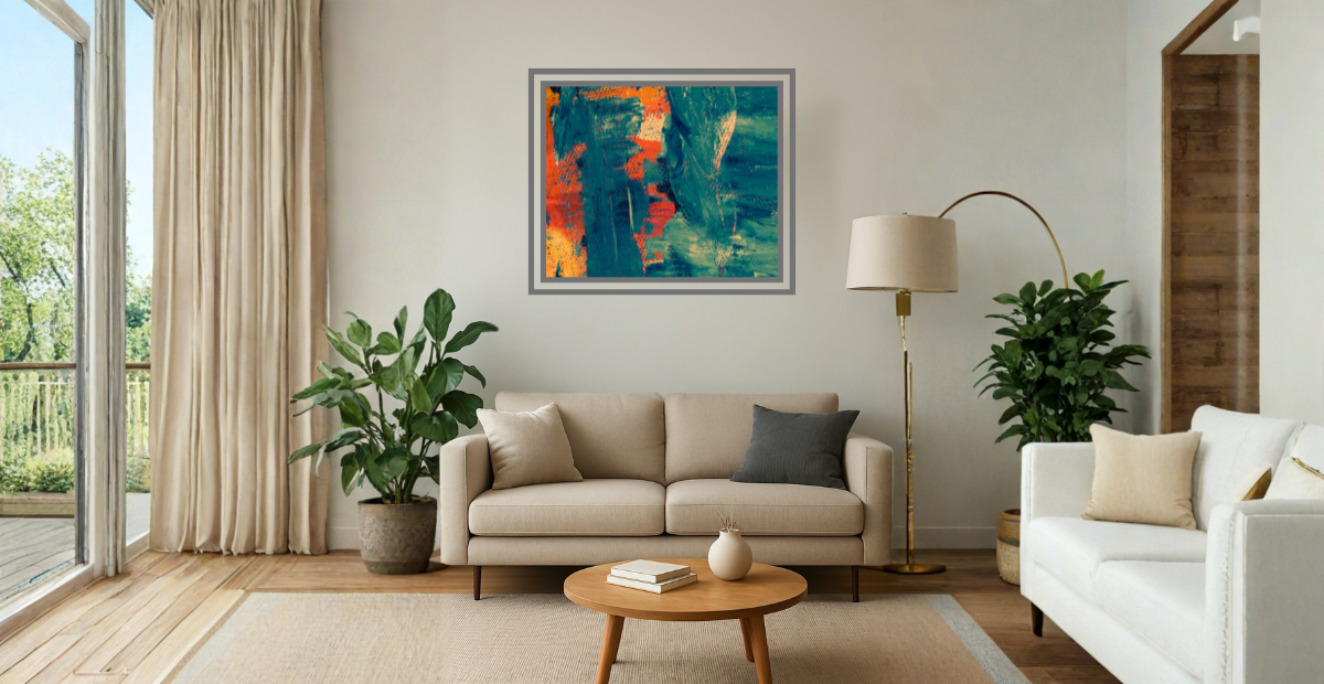
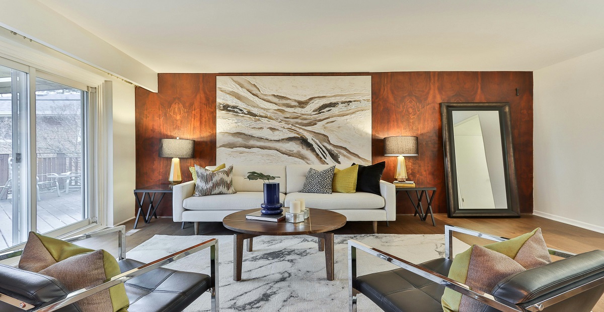
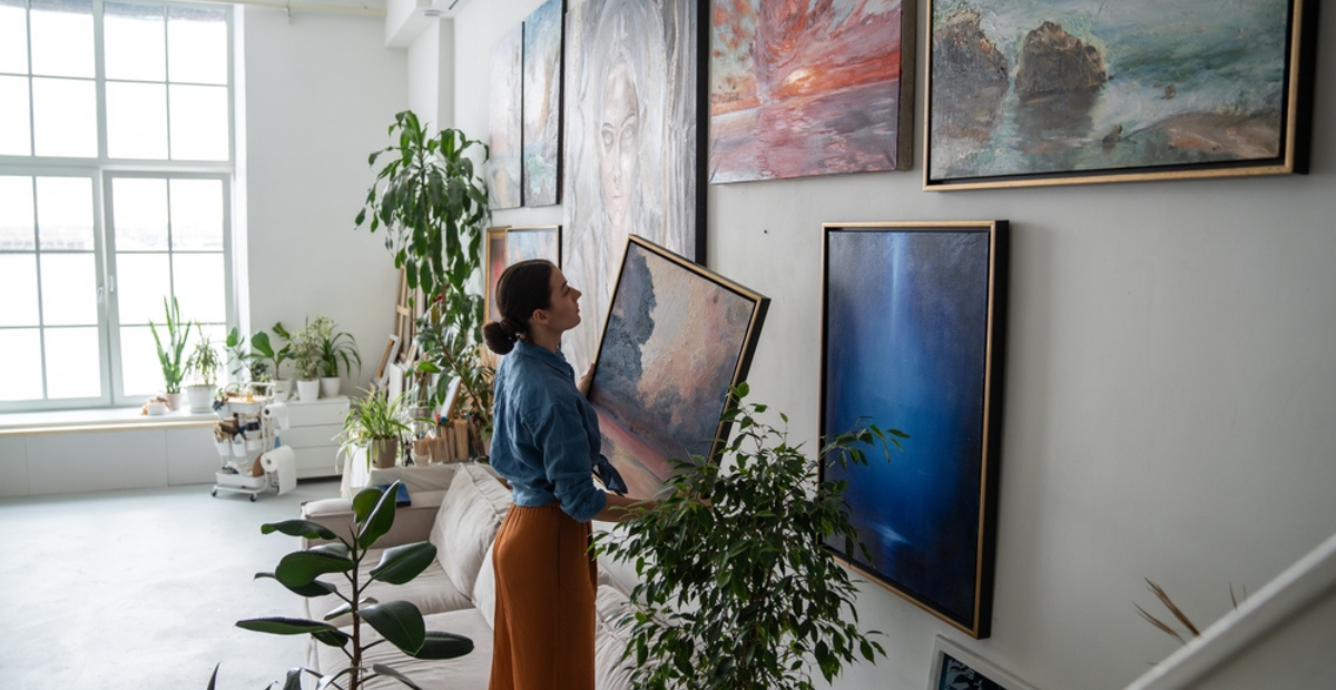
- Living room: A panoramic piece above the sofa establishes a clear focal point and organizes seating. If you prefer a gallery wall, use one larger anchor with two or three supporting works to avoid visual noise.
- Bedroom: Wide, low compositions with softened edges promote rest. Place above the headboard or opposite the bed to create a steady, end-of-day horizon.
- Entryway or hall: A confident vertical draws the eye forward and gives movement to transitional spaces.
- Workspace: Fields of color with moderate contrast encourage focus without competing with screens. For a social office nook, consider abstract wall art for living room scale pieces (think 36-48 inches wide) to set an inviting tone.
Quick room guide:
| Room/Zone | Suggested Size Range | Mood Cue |
| Living room over sofa | 60-72% of sofa width | Anchor and gather |
| Bedroom above headboard | 50-65% of bed width | Calm and steady |
| Entry or hallway | 24-36 in. vertical | Direction and flow |
| Desk or reading niche | 20-30 in. horizontal | Focus and ease |
Selecting with Intent
Start with emotion, confirm with logistics. Some people wonder, “how do I choose the right size handmade abstract painting for my living room?” The simplest path is to begin with scale, then check palette, surface, and versatility. Ask: How do I want this room to feel? Then test candidates against four practical filters:
- Scale – A painting that’s too small will seem timid; too large can overwhelm. Aim for proportional harmony with the furniture beneath it.
- Palette – Pull two or three accent colors from the painting into textiles or accessories to create a cohesive loop.
- Surface – Texture changes how light lives in a room. If you have strong overheads, look for varied paint relief; if you rely on lamplight, layered veils of color can glow beautifully.
- Versatility – Choose a piece that can migrate if you reconfigure rooms. Many abstracts work across multiple settings, so a move doesn’t mandate a new acquisition.
If distinct needs arise, like a commemorative piece, brand colors, or a nonstandard wall, consider a custom abstract painting on canvas. Commissioning lets you define size, undertone, and energy while leaving the artist free to surprise you within those rails.
Scale, Color, and Light Made Simple
Right piece, right place, right glow:
- Scale math: Two-thirds the width of the furniture beneath is a reliable baseline. Go bigger when the wall is vast or ceilings are high.
- Color dialogues: Let the painting “talk” to one or two elements already in the room, curtains, a stone mantel, a rug border, so it feels embedded rather than introduced.
- Light tactics: Indirect daylight reveals texture and true color; warm LEDs (2700-3000K) enrich mid-tones at night. Angle fixtures slightly to keep reflections off varnished areas. A modest dimmer lets you tune the mood from morning to evening.
These micro-decisions make a macro difference; they’re the reason a well-placed abstract can feel like a window rather than a rectangle.
Care without Fuss
Originals ask for attention, not anxiety. Keep canvases away from harsh sun and high humidity, dust frames gently with a dry microfiber cloth, and handle works by the frame edges, not the canvas, when moving them.
If a surface looks dull over many years, consult a conservator rather than attempting DIY fixes. A little care preserves a lot of color, ensuring your investment remains a steady source of atmosphere and joy.
Conclusion: Personality That Lasts
Decor trends shift, but a considered abstract remains relevant because it reflects your rhythm rather than a passing rule. Choose one intentional anchor for each major room, let supporting pieces echo its palette or gesture, and allow space for the ensemble to breathe. With that approach, the painting becomes a dependable constant while everything else, flowers, throws, even layouts, can change as seasons and needs evolve.
At Kalashree Art, we curate a focused selection of handmade abstract painting options created by practiced hands and thoughtful minds. We help clients navigate scale, light, palette, and placement, whether they’re exploring a first piece or refining a growing collection, and we offer guidance when a commission makes sense, including handmade painting on canvas sizes tailored to real rooms.
If you’re ready to find work that feels unmistakably yours, we invite you to explore, ask, and choose with confidence!
FAQs
1) How do I pick the right size for a statement piece above a sofa?
Aim for a width around two-thirds of the sofa (or the console or bed beneath). If your ceilings are high or the wall is wide, size up slightly. Mock up the footprint with taped kraft paper for a day to confirm scale and sightlines.
2) What lighting setup helps abstract canvases look their best?
Indirect daylight reveals texture and accurate color without glare. In the evening, use warm LEDs (around 2700-3000K) and angle the fixtures slightly off-axis to avoid reflections; a dimmer lets you tune the mood for different activities.
3) How can I commission a piece that fits my palette and space?
Share dimensions, photos of the room, and 3-5 reference colors or materials such as a rug, curtains, or wood tone. Describe the mood in a few words such as calm, energetic, or grounded, and agree on timelines for sketches and final delivery. This simple brief keeps the process creative yet aligned with your space.
Related Posts
Madhubani art, often called Mithila art, comes from a place where painting was woven into
Selecting art for a luxury home is seldom as easy as spotting a pretty canvas

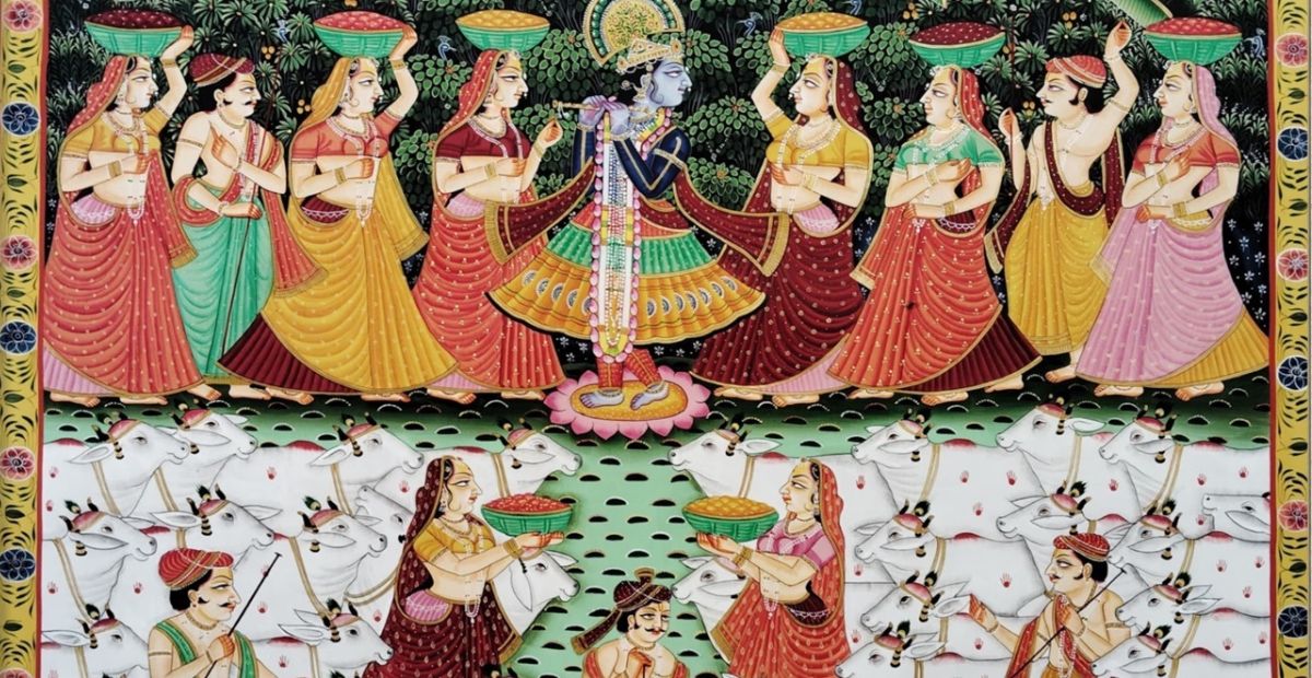
At first glance, a Pichwai can feel like a dream pulled onto cloth: Krishna, cows,
New beginnings are not always loud. Sometimes they look like a packed carton in a
The night is supposed to be the slowest, most pliable part of the day. In
A blank wall is not just “empty space.” It is a missed story. Many people