
Living rooms in 2025 set the tone with handmade flower painting

Introduction
Living rooms in 2025 do more than host movie night. They set the emotional tone for the home, guiding everything from palette choices to how light moves through the space. Floral art made by hand has emerged as a quiet power player. A handmade flower painting brings movement and softness, turning a static wall into something that feels alive.
This is not about copying a bouquet; it is about translating stems, petals, and air into brushwork that breathes with the room. Below, in this blog, you will find a simple approach to choosing the right piece, placing it with confidence, lighting it well, and caring for it so it grows with your style across seasons.
Why florals belong in 2025 living rooms
Several shifts are shaping living rooms now, a softer minimalism, a return to natural textures, and a preference for rooms that support real routines from quiet mornings to lively evenings.
Florals align with this because they read as optimistic without becoming loud. They pair with wood, stone, boucle, and matte metals, and they hold their own next to textured textiles. The right painting feels like open air inside a closed room, a visual exhale that helps a busy day slow down. Just as important, an original handmade painting carries authorship you can sense up close in the ridges, veils, and tiny irregularities that record the maker’s hand.
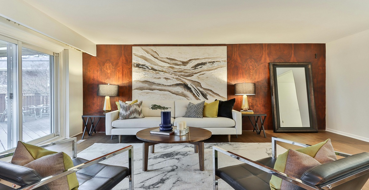
If you are considering an original painting for modern living room walls, focus on layered surfaces and a palette that echoes your materials so the artwork feels built into the architecture.
How florals shape mood
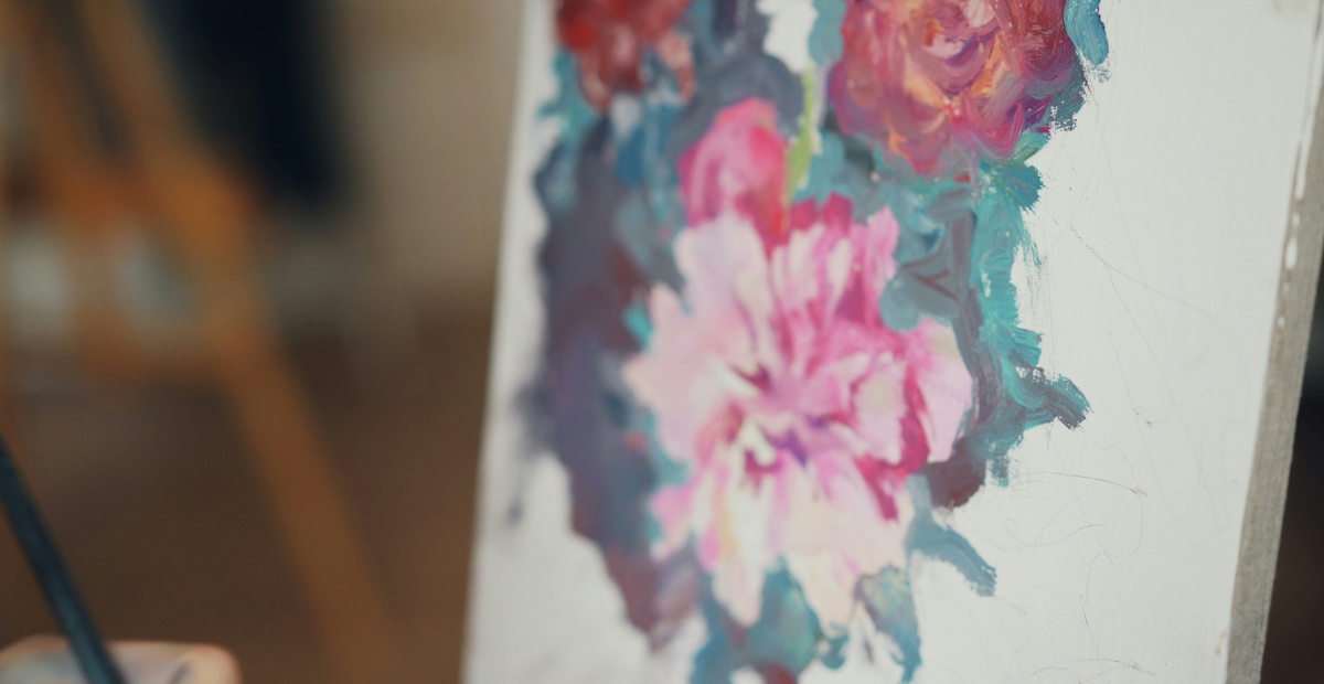
Flowers carry emotion in both obvious and subtle ways. Large fields of close values feel restful. Sharper edges and higher contrast introduce energy. Slender stems and gentle arcs guide the eye across the room, creating a natural flow.
Up close, you should see decisions in the paint; a step back should let the composition settle the space. These cues are quiet, but they add up to presence over time. Because a handmade flower painting reflects actual movement and touch, it rewards slow looking day after day instead of flattening into background decor.
Read, select, and scale without guesswork
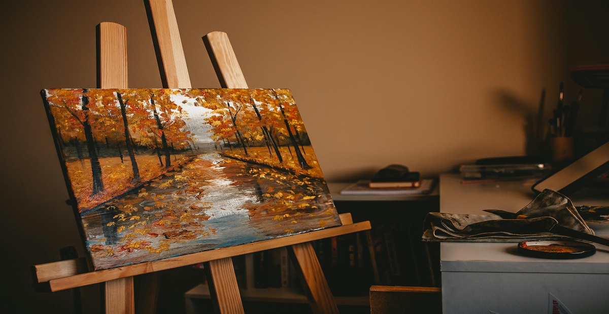
You do not need an art degree to evaluate a floral canvas. Train your eye to spot a few fundamentals, then match them to your room’s job. Some people search, “best size for handmade flower painting in living room?” A reliable starting point is the two thirds rule, and you can size up slightly for wide walls or high ceilings.
- Gesture: Long, confident strokes suggest momentum and clarity, while soft, layered gestures feel contemplative and musical.
- Edges: Hard edges read graphic and modern; softened or broken edges suggest atmosphere and depth.
- Contrast: Large jumps from light to dark create drama; closer values calm a space and help it feel expansive.
- Scale: As a baseline, choose a canvas that spans about two thirds of the furniture beneath it. Size up slightly for very wide walls or high ceilings.
A quick test helps. Say three words while looking at a candidate painting, for example calm, grounded, luminous. If those words match the job you want the living room to do, you are on the right track. When you are shortlisting options, look for one piece with clear leadership and let smaller works respond to it rather than compete. If you need unusual dimensions or a specific undertone, consider commissioning an original handmade painting sized and toned for your wall.
Placement and light made simple
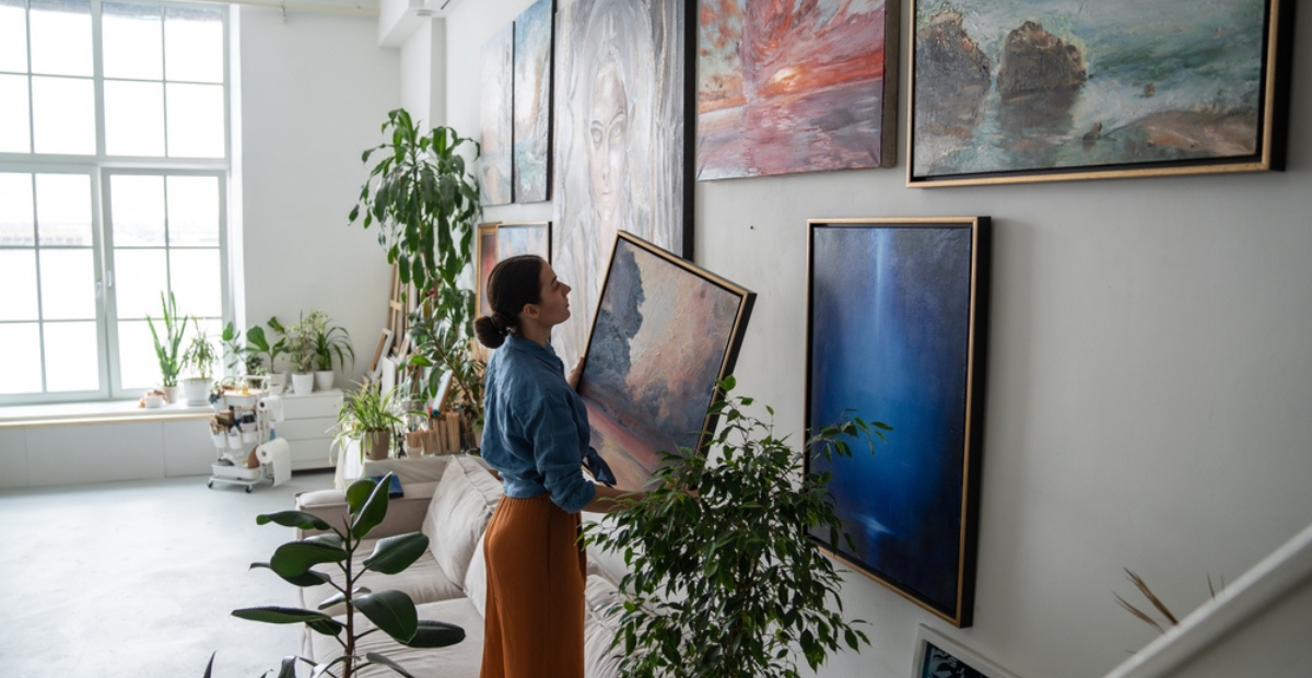
Right piece, right place, right glow. Good placement turns a nice canvas into the room’s steady center, and thoughtful light reveals the texture you paid for.
- Placement basics: Keep the center of the artwork near eye level for most viewers, roughly 56 to 60 inches from the floor. A low, wide floral above a sofa reads like a horizon and helps a room feel settled. A tall, airy arrangement near a window extends the sense of height and draws light deeper into the space.
- Gallery wall strategy: If you prefer clusters, give one painting the lead role and space the others with breathing room. Avoid equal sizes in a row; vary heights and widths so the eye moves easily.
- Lighting cues: Indirect daylight shows true color and surface detail without glare. In the evening, warm LED bulbs around 2700 to 3000 Kelvin enrich mid tones. Angle fixtures slightly so reflections slide off varnished areas. A dimmer lets you tune the mood from morning to night.
These small decisions make a large difference. They are why a well placed floral can feel like a window rather than a rectangle.
Materials, quality, and care
The support and finish matter as much as the image. Stretched cotton or linen with sound priming keeps the surface stable, while solid stretcher bars prevent warping. If you plan to hang without a frame, check that the edges are finished neatly; if you prefer framing, a slim floater adds a crisp shadow gap and lifts the canvas off textured walls. Varnish protects color and unifies sheen. A matte or satin finish usually suits living rooms because it reduces glare while keeping colors rich.
Care is simple. Keep the painting out of harsh direct sun and away from high humidity. Dust the frame with a dry microfiber cloth and handle by the frame edges, not the canvas, if you move it. If, after years, the surface loses luster, consult a conservator rather than attempting DIY fixes. These habits protect both color and structure so the work looks as fresh in a few years as it does today.
Wrapping Up: setting the tone
The living room carries the home’s first impression and its lasting afterglow. One intentional floral canvas can give that room a voice that is calm, open, and quietly alive. Start with a clear anchor, leave breathing space around it, and let smaller elements echo a few of its colors or gestures. That approach keeps balance as life moves through the space. Over time, the painting feels less like an object and more like a companion that reflects the way you live.
At Kalashree Art, we curate florals with considered palettes, layered surfaces, and archival materials so they hold up to daily light and long viewing. We help clients assess scale, light, and placement and we advise when a commission makes sense for specific walls or moods. If you are ready to find work that feels unmistakably yours, we invite you to explore, ask, and choose with confidence.
Frequently Asked Questions
1) How do I choose the right size for above the sofa?
Aim for a width around two thirds of the sofa. For very wide walls or high ceilings, size up slightly so the canvas reads as the focal point rather than a small accent.
2) What lighting brings out texture without glare?
Indirect daylight shows true color and brushwork. After dark, use warm LEDs around 2700 to 3000 Kelvin and angle fixtures a little off axis so reflections slide off the surface.
3) How do I make the painting feel integrated with the room?
Echo one or two of its colors in nearby textiles or ceramics, keep surrounding elements a little quieter, and give the canvas breathing room so it can lead without competition.
Related Posts

Madhubani art, often called Mithila art, comes from a place where painting was woven into
Selecting art for a luxury home is seldom as easy as spotting a pretty canvas

At first glance, a Pichwai can feel like a dream pulled onto cloth: Krishna, cows,
New beginnings are not always loud. Sometimes they look like a packed carton in a
The night is supposed to be the slowest, most pliable part of the day. In
A blank wall is not just “empty space.” It is a missed story. Many people