
Warm minimalism in 2025 finds its heart in handmade abstract painting


Introduction
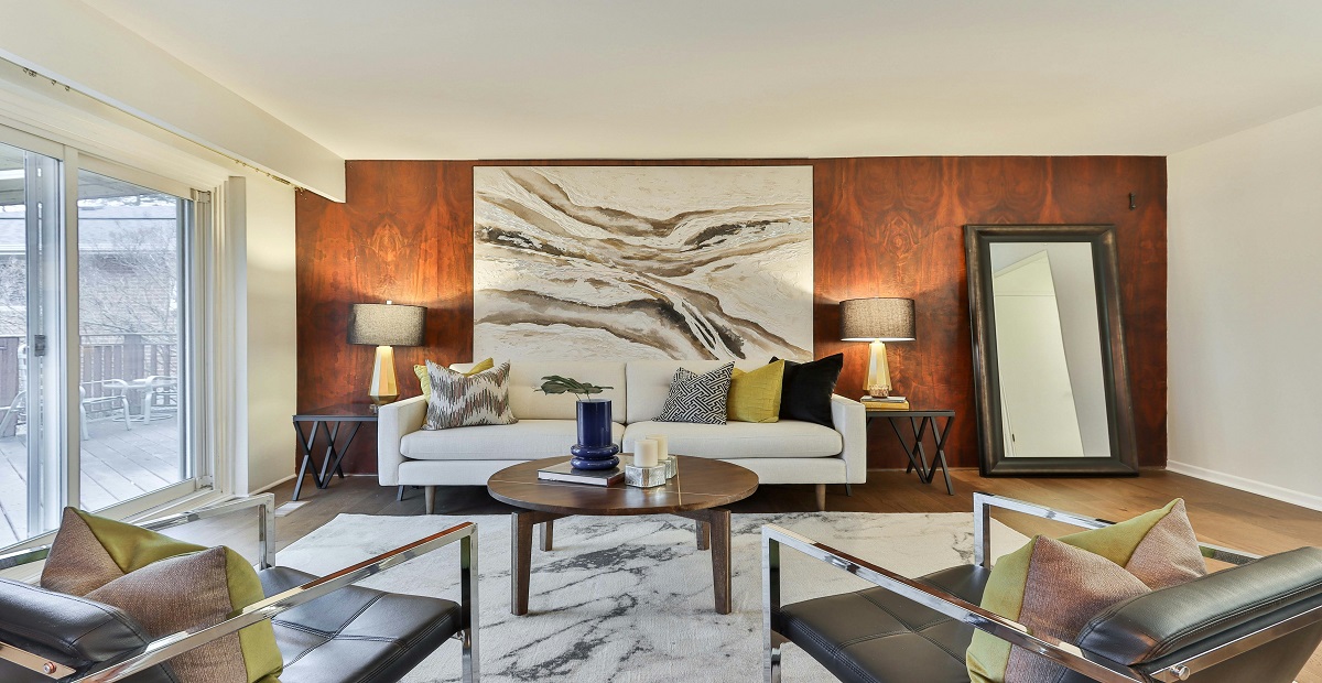
In 2025, warm minimalism is less about empty rooms and more about rooms that breathe. Natural textures, rounded edges, and lived-in palettes set a calm foundation, then one decisive artwork gives the space a clear voice. That is where a handmade abstract painting earns its place. It brings gesture, depth, and a human rhythm that a purely functional layout cannot supply.
If you are curating handmade paintings for home, abstraction is unusually adaptable: it can soften strong lines in a modern apartment or add clarity to layered, collected interiors. In the guide that follows, you will learn what makes abstracts work so well for warm minimalism, how to choose scale, colour, and surface, where to place them for everyday impact, and how to care for them. Real-world examples show the difference a single canvas can make, from compact studios to open-plan living rooms.
Warm Minimalism Today
Warm minimalism prioritises comfort and clarity over strict austerity. Think oak, linen, stone, and quiet colour families, then a single focal point to organise the room. Within this approach, an original handmade painting does quite architectural work: layers of paint catch daylight, small irregularities scatter lamplight, and colour undertones stitch together materials already in the room.
Unlike literal scenes that can lock a space into one mood, abstraction stays interpretable, which keeps a room from feeling over-explained. The result is a living area that reads calm from a distance and rewarding up close, a practical definition of luxury for 2025.
Why Abstraction Works
Minimal does not mean minimal feeling. Abstraction translates movement and atmosphere into form, so you can tune energy without adding visual clutter. A handmade abstract painting with close, low-contrast fields settles a bedroom or reading corner; crisp, interlocking shapes sharpen a home office; airy, veiled passages open up a tight hall.
Because the artist’s decisions remain visible at arm’s length, you get something that feels made rather than manufactured. That presence is what warm minimalism needs most, a single, human note that steadies the whole room.
Rooms That Breathe
Abstracts are versatile across scales and floor plans. Here are practical placements that respect warm-minimal principles, with quick examples from real homes:
- Living room anchor: A horizontal canvas sized to roughly two-thirds the sofa width becomes the visual horizon. Example: In a 3-room city flat, a low, wide piece in soft terracotta and fog blue instantly made the seating area feel deliberate rather than improvised.
- Entry or transition: A tall vertical near the door draws the eye forward and reduces visual noise. Example: A long hallway felt shorter once a slim vertical with lifted brushwork repeated the home’s oak tones.
- Workspace corner: Mid-scale abstractions with moderate contrast energise without competing with screens. Example: A remote designer placed a 30-inch study piece beside the monitor; the texture encouraged short breaks and reduced “flat screen fatigue.”
If you are assembling handmade paintings for home in an open plan, choose one leader for the main wall, then echo its undertones in one or two smaller works across dining or reading zones. The room feels cohesive without looking staged.
Scale That Works
Sizing is where most hesitation occurs, but a few rules keep decisions simple:
- Start with furniture width: Aim for a canvas that spans 60 to 70 per cent of the item beneath it, such as a sofa or console.
- Mind the verticals: In rooms with high ceilings or narrow walls, go taller than you think. Vertical energy steadies architectural proportions.
- Centerline matters: Keep the midpoint of the artwork around 56 to 60 inches from the floor for most viewers.
- Lead and support: If you prefer clusters, appoint one lead canvas and give it breathing room. Let smaller pieces “reply” rather than compete.
A long-tail tip for searchers: many people planning warm minimal spaces look for minimalist abstract canvas art for 2025 homes, which simply means pieces with soft transitions, grounded palettes, and visible brushwork that reward close viewing without shouting from across the room.
Colour Meets Light
Colour is the quiet driver of mood, light is the amplifier. Use them together with restraint.
- Choose a base note: Pick one grounded hue already present, like oak brown, limestone gray, or clay pink, then allow the painting to echo it with small surprises.
- Limit the chorus: Two accent colours are usually enough. This keeps the palette readable and calm.
- Tune the glow: Indirect daylight reveals surface detail and true colour. In the evening, warm LEDs around 2700 to 3000 Kelvin enrich mid-tones. Angle fixtures slightly so reflections slide off varnished areas, and use a dimmer to shift from task to evening mode.
When colour and light cooperate, the canvas stops looking like a rectangle and starts reading like a window.
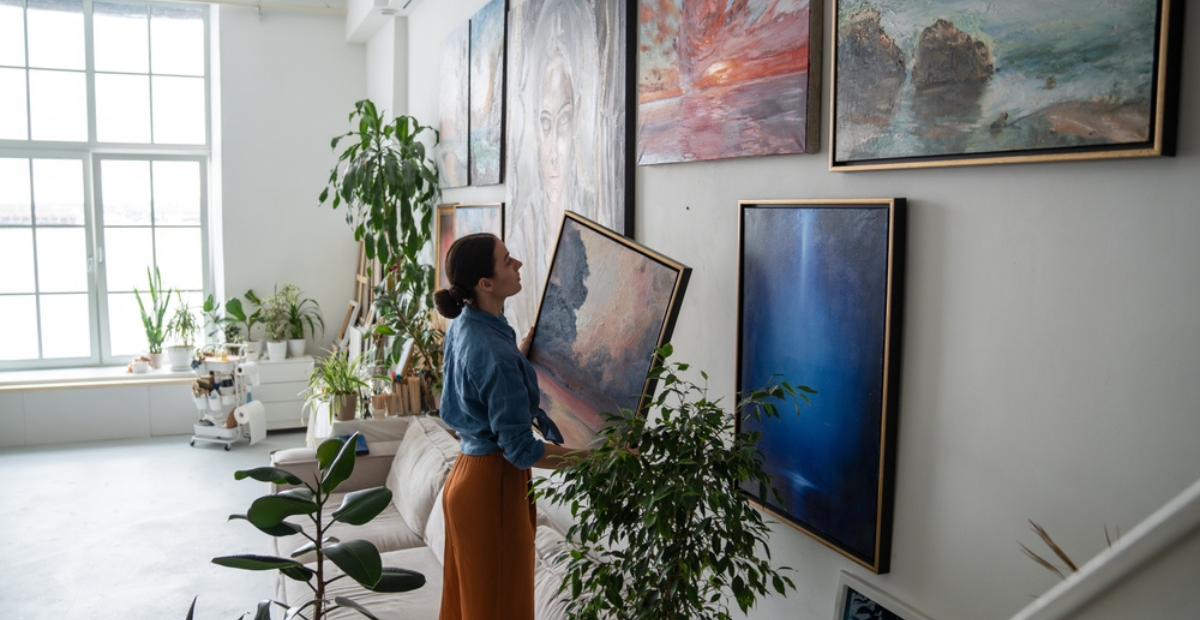
Choose With Clarity
Selecting online or in-studio is straightforward when you know what to ask for. Use this checklist before you commit:
- Surface and build: Request close-ups of edges and texture. Painted sides or a clean wrap finish allow frameless hanging; a floater frame adds a crisp shadow gap.
- Materials: Look for artist-grade pigments and primed cotton or linen. Ask about varnish type to match the sheen you prefer, matte or satin.
- Dimensions, framed and unframed: Confirm exact outer size so the piece fits above furniture without guesswork.
- Light check: Ask for a short video under window light and warm lamplight to see how undertones shift.
- Placement mockup: Tape paper at the proposed size on the wall for 24 hours and live with it through morning and evening light.
When a brief is more specific, size, undertone, and energy, commissioning an original handmade painting is the most reliable route. You define the constraints; the artist delivers surprise within them.
Care That Lasts
Good care is uncomplicated and keeps a canvas looking fresh for years.
- Keep artwork out of harsh, direct sun and off damp-prone walls.
- Dust frames with a dry microfiber cloth; never spray near the surface.
- Lift by the frame, not the fabric, when moving.
- If the surface ever seems dull after many years, consult a conservator rather than attempting DIY fixes.
The goal is to protect colour and structure so the work remains a steady part of your daily routine.
Wrapping Up: A Quiet Finish
A warm-minimal space hinges on one quiet organiser. An abstract canvas can fill that role without fixing the story: a large anchor above the sofa, a vertical to guide a hall, or a calm study near the desk. Use the two-thirds rule for scale, echo one or two materials in colour, and leave breathing room. As you live with it, the surface becomes familiar, the brushwork pauses you for a moment, and the room stays balanced long after trends pass.
At Kalashree Art, we curate pieces that suit warm minimalism, layered colour fields, readable textures, and sizes for real rooms. Guidance on proportion, lighting, and placement is available. If needed, a commission for an original handmade painting can be arranged to fit a specific wall or color palette. The abstract collection includes modern and acrylic pieces for living rooms, bedrooms, and offices. Custom options are offered when a special size or undertone is required. Visitors can browse at their own pace with clear photos and measurements to choose confidently!
FAQs
1) How should a warm-minimal living room be sized for art?
Aim for a canvas about two-thirds the width of the furniture beneath it, then adjust for architecture. Tall ceilings or very wide walls usually benefit from sizing slightly larger to keep the piece visually in charge.
2) What finishes work best for low-glare evenings?
Matte or satin varnish reduces glare while preserving colour richness. Pair with warm LEDs around 2700 to 3000 Kelvin and angle fixtures a bit off-axis so reflections slide away from the viewer.
3) Should a handmade abstract canvas be framed or left unframed?
Both work well. A float frame gives a clean, finished edge with a subtle shadow gap, while a gallery-wrapped canvas (no frame) feels modern and minimal. Match the choice to your room’s materials and lines, and keep lighting slightly off-axis to avoid glare.
Related Posts

Madhubani art, often called Mithila art, comes from a place where painting was woven into
Selecting art for a luxury home is seldom as easy as spotting a pretty canvas

At first glance, a Pichwai can feel like a dream pulled onto cloth: Krishna, cows,
New beginnings are not always loud. Sometimes they look like a packed carton in a

The night is supposed to be the slowest, most pliable part of the day. In
A blank wall is not just “empty space.” It is a missed story. Many people